Back
10/05/25
Identity & Wayfinding
Logo Design And Visual identity for JL Perle
The project overview
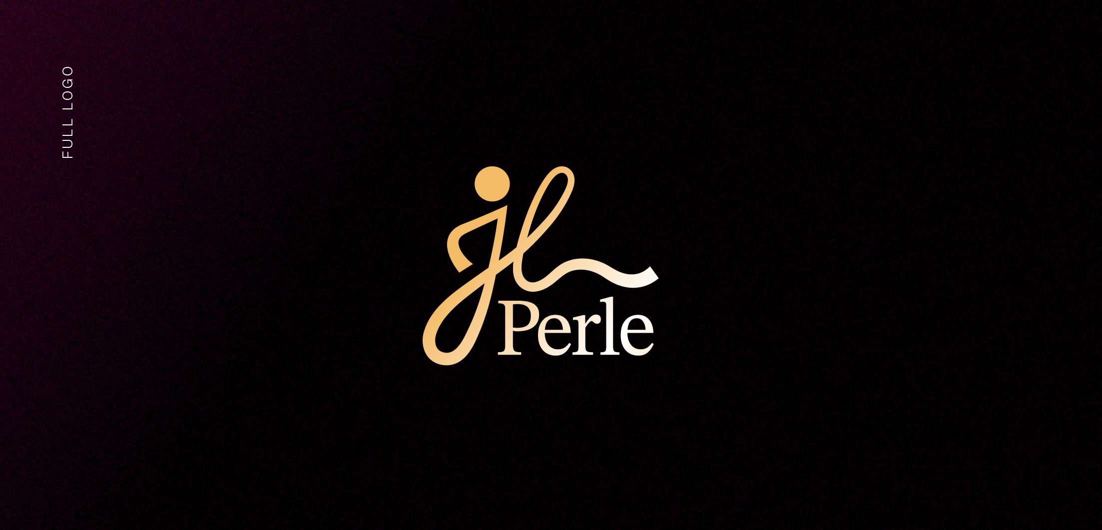
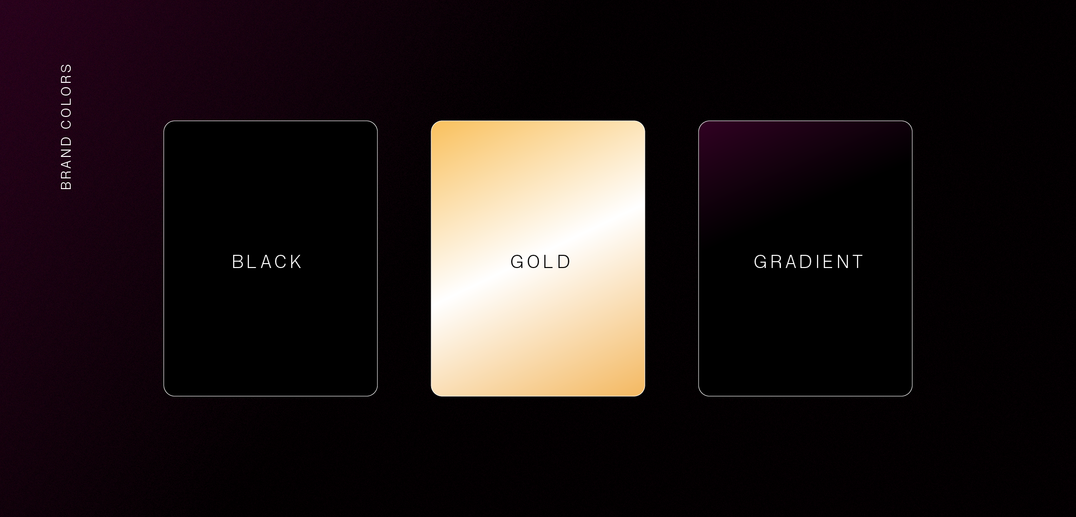
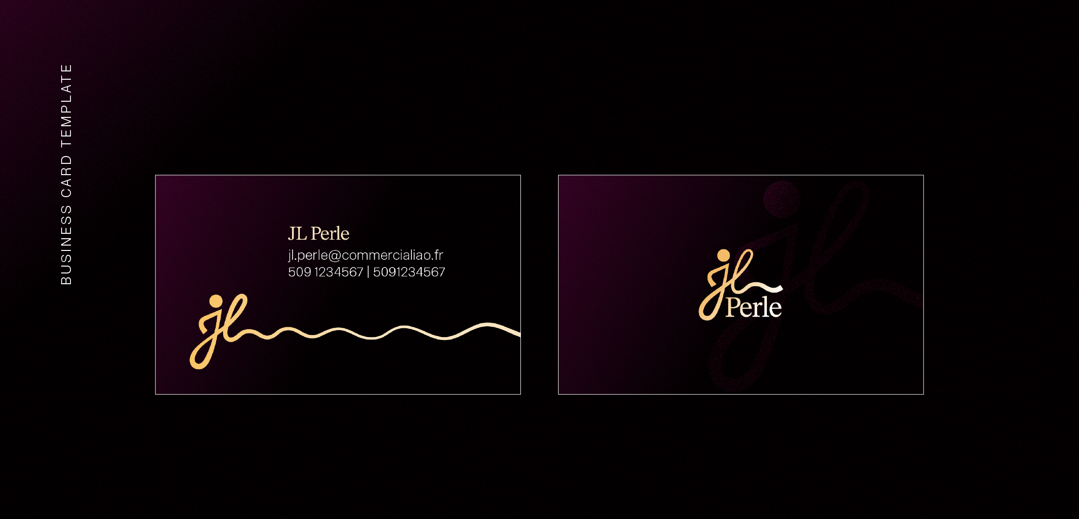
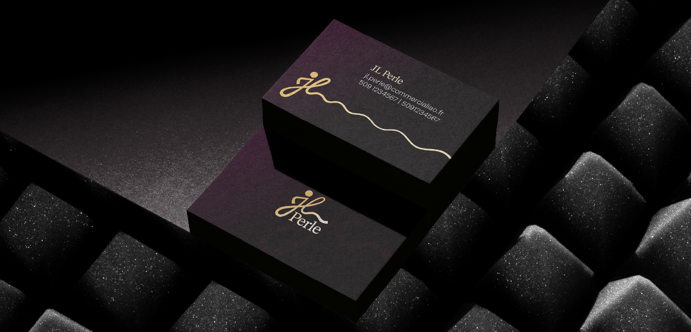
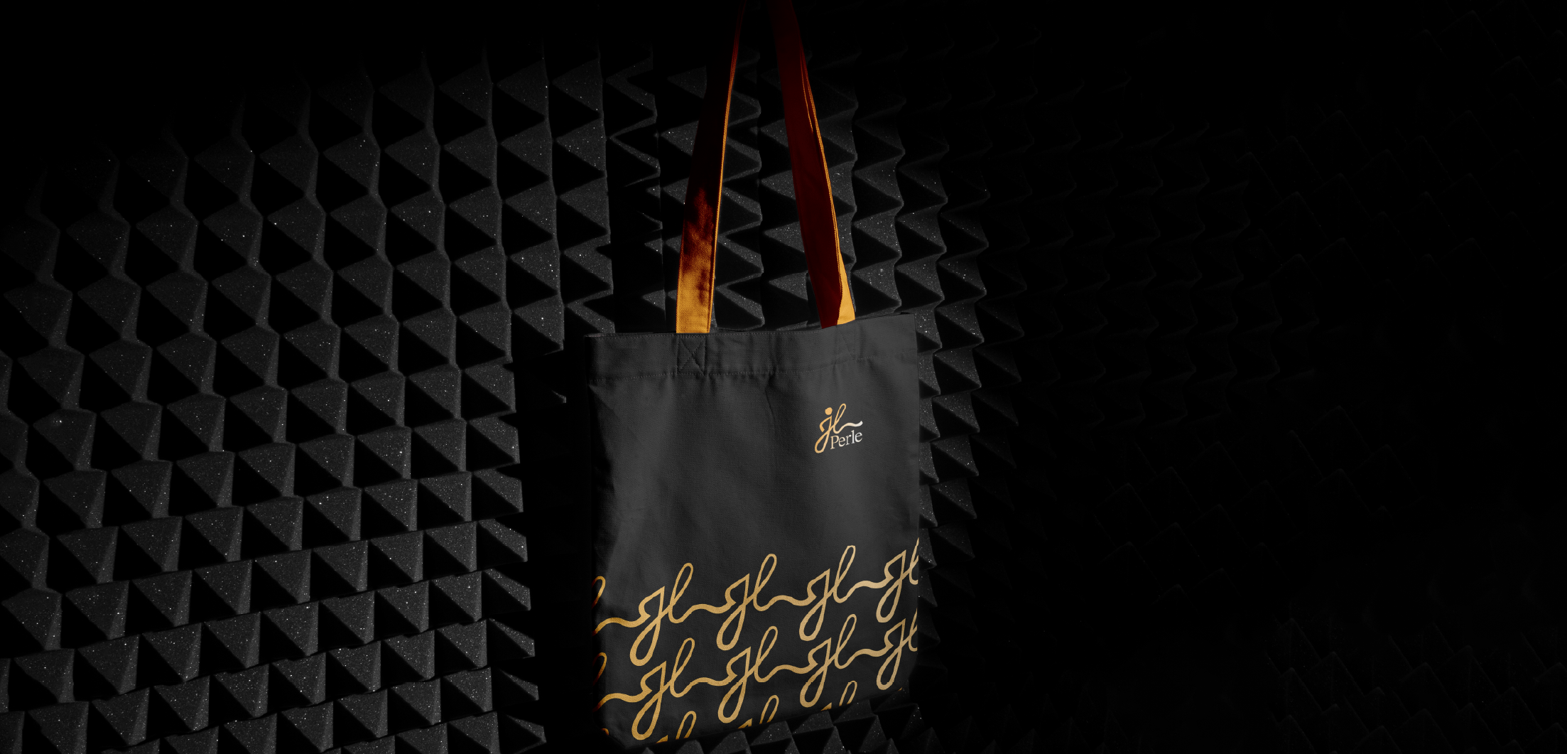
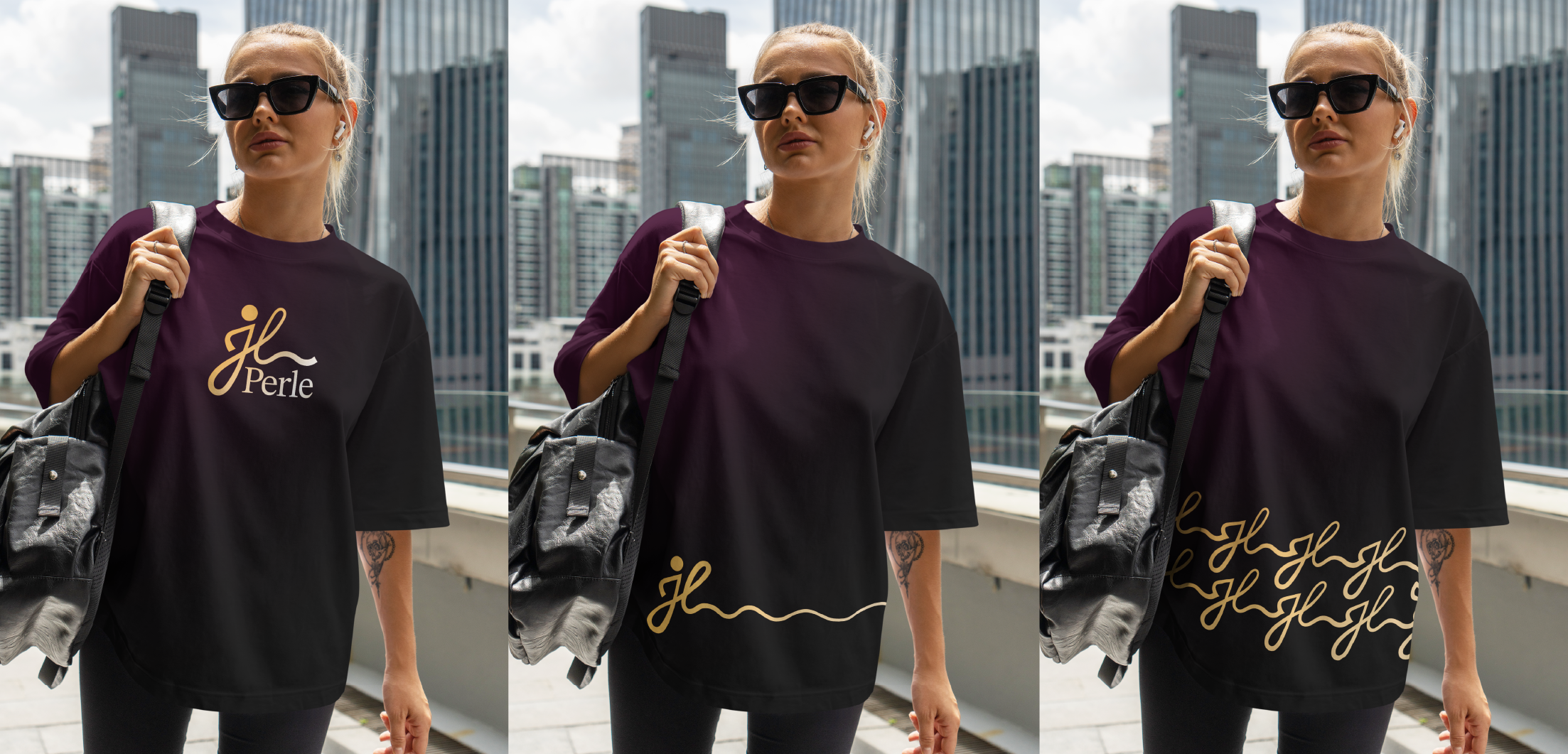
The JL Perle logo embodies elegance and refinement through a minimalist and sophisticated design. The fluid signature formed by the “JL” initials evokes luxury, authenticity, and craftsmanship, while the golden circle positioned above the “J” subtly symbolizes a pearl a discreet and elegant reference to the brand’s name. The word “Perle,” set in a classic serif typeface, brings balance and stability to the overall composition. The use of black and gold reinforces the brand’s sense of prestige, exclusivity, and distinction. The resulting logo conveys a strong, modern, and timeless identity, perfectly aligned with JL Perle’s values of luxury, simplicity, and excellence.
Visual identity
Next