Visual identity
Logo and and Visual Identity for Essor Dental Clinic

The project overview
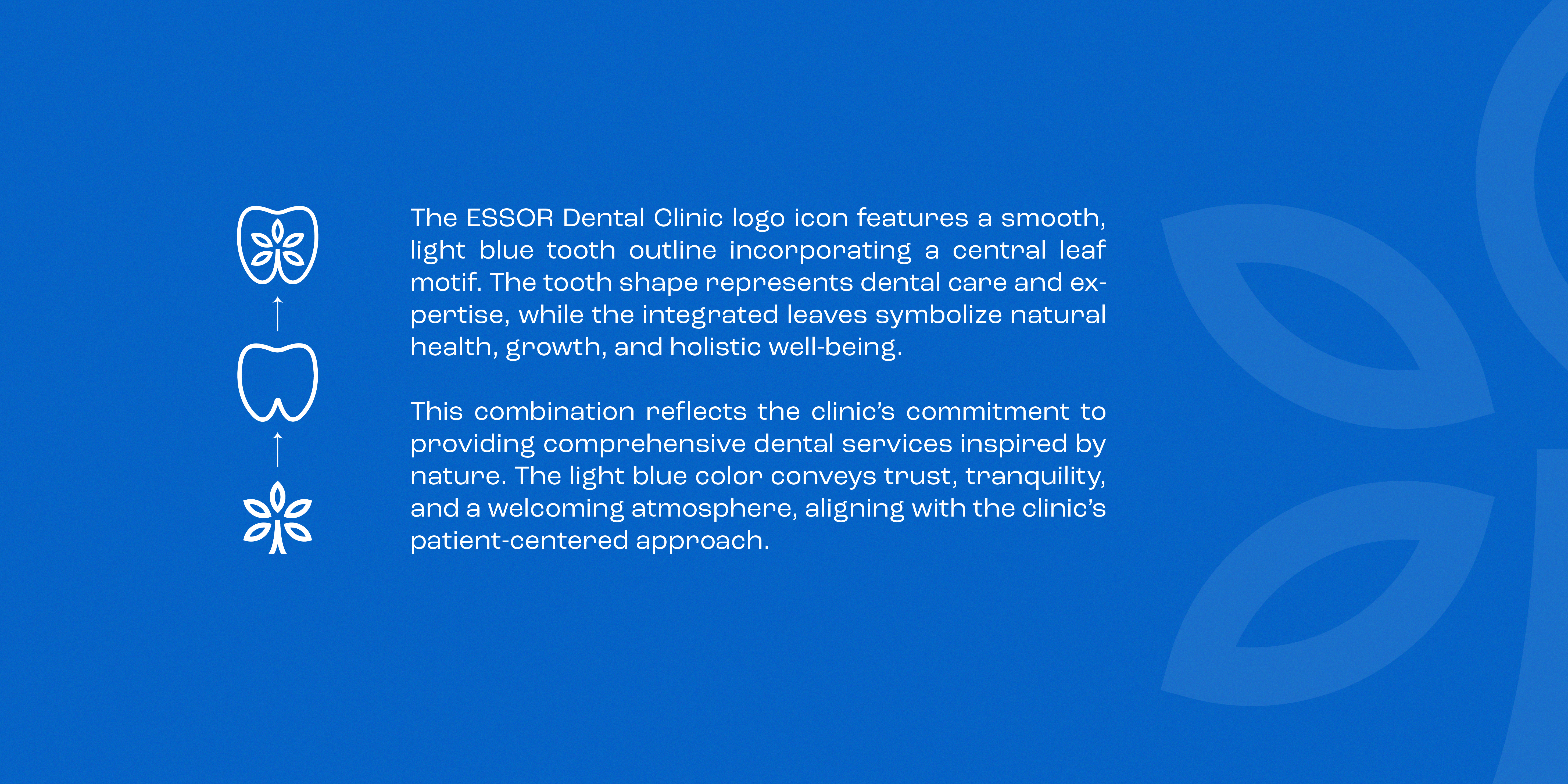
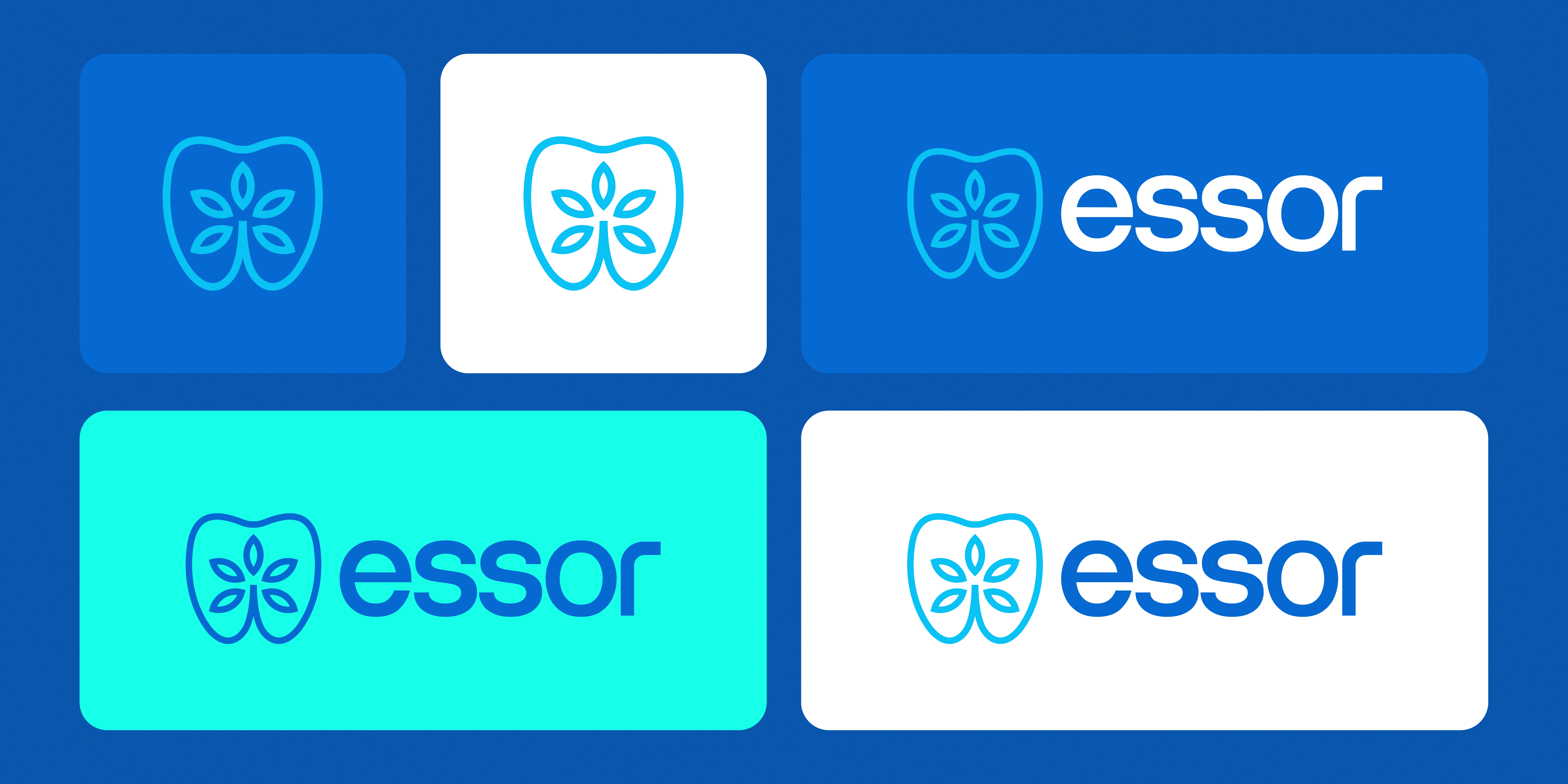
ESSOR Dental Clinic is a modern dental care brand built around the idea of healthy growth, trust, and holistic well-being. Its visual identity combines a recognizable tooth silhouette with an organic leaf motif, creating a distinctive symbol that connects professional dental expertise with a more natural and human approach to care. The name “ESSOR,” meaning growth and progress, reinforces the brand’s purpose of helping patients move toward healthier, more confident smiles.
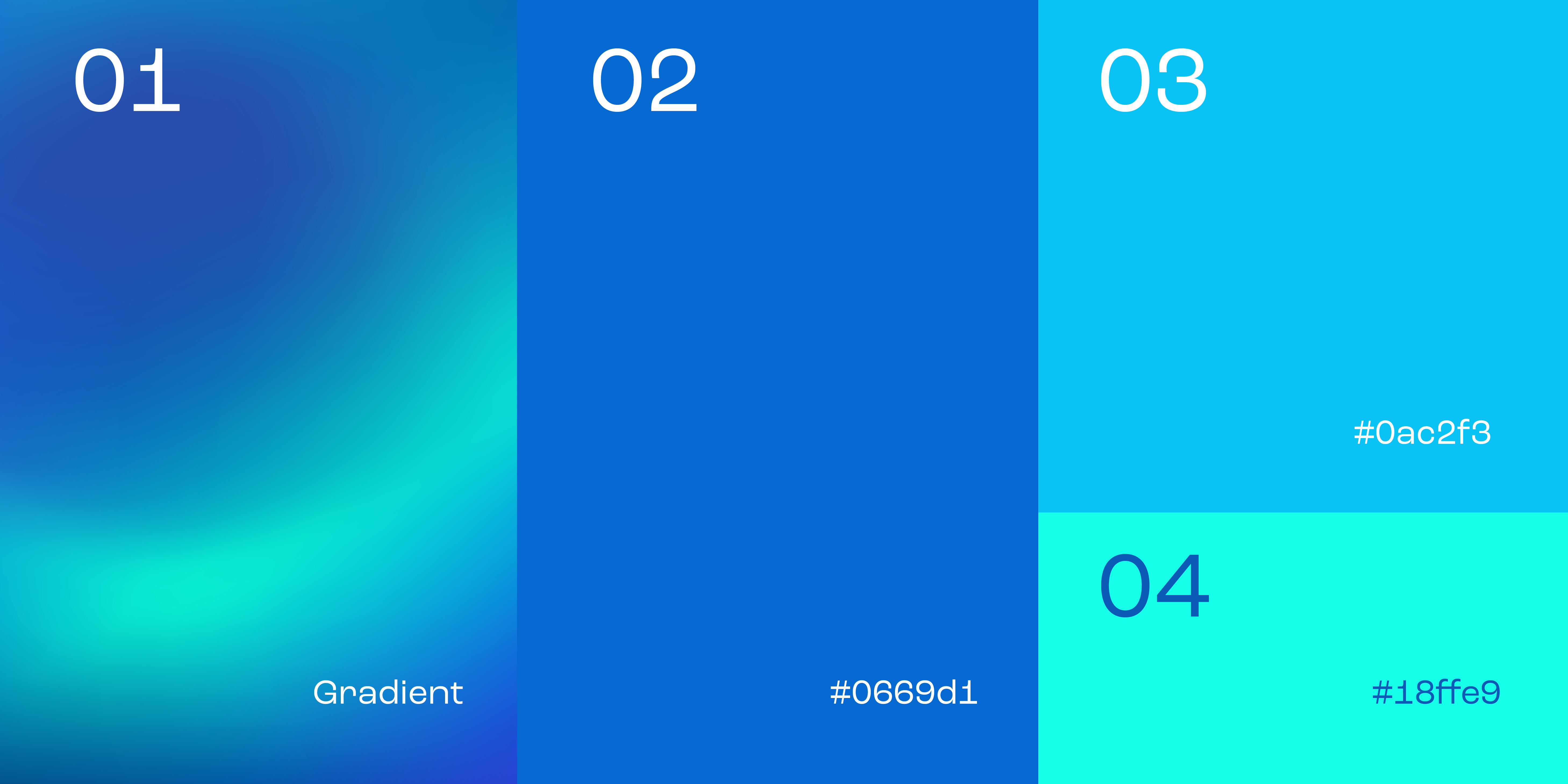
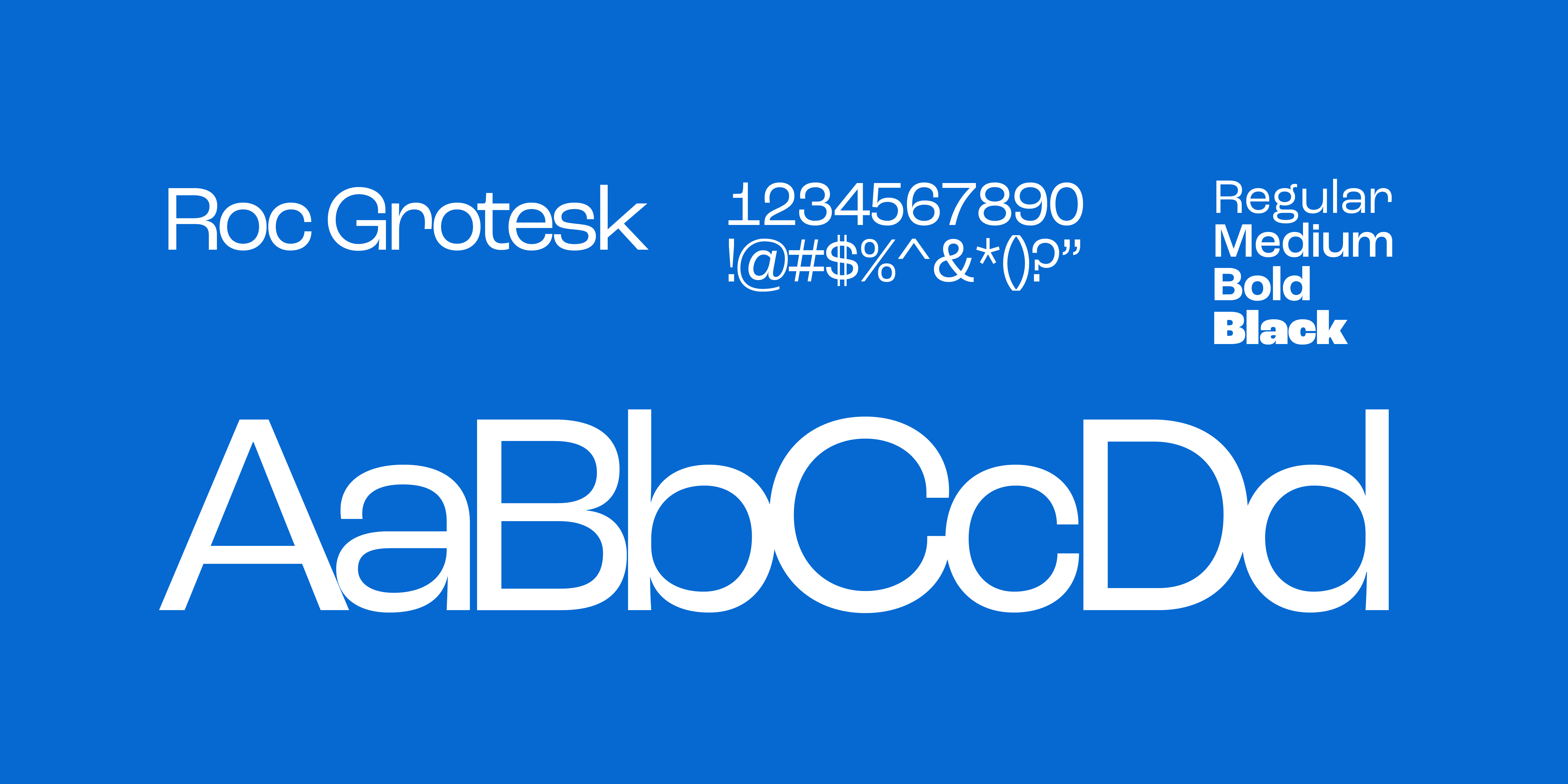
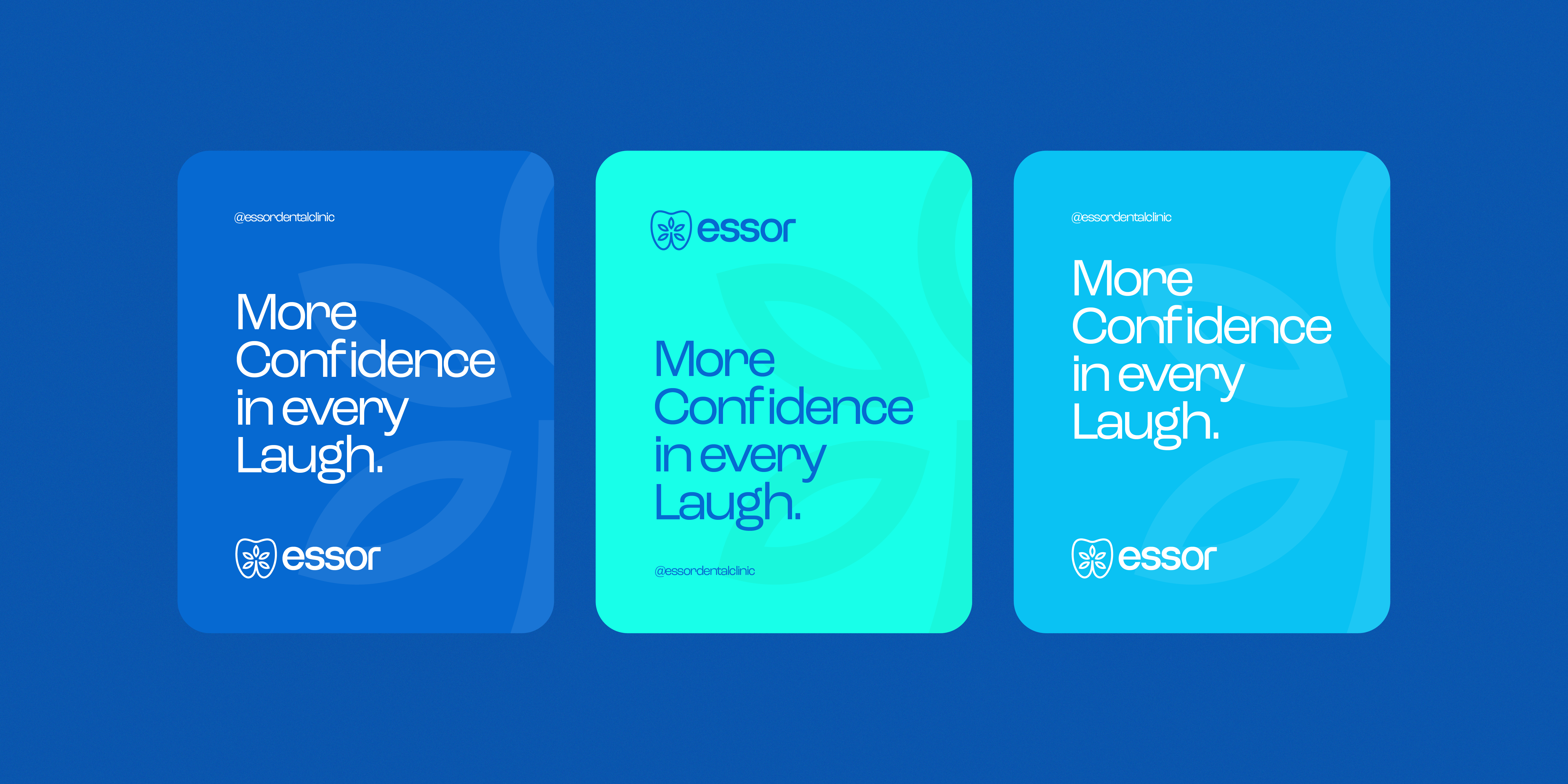
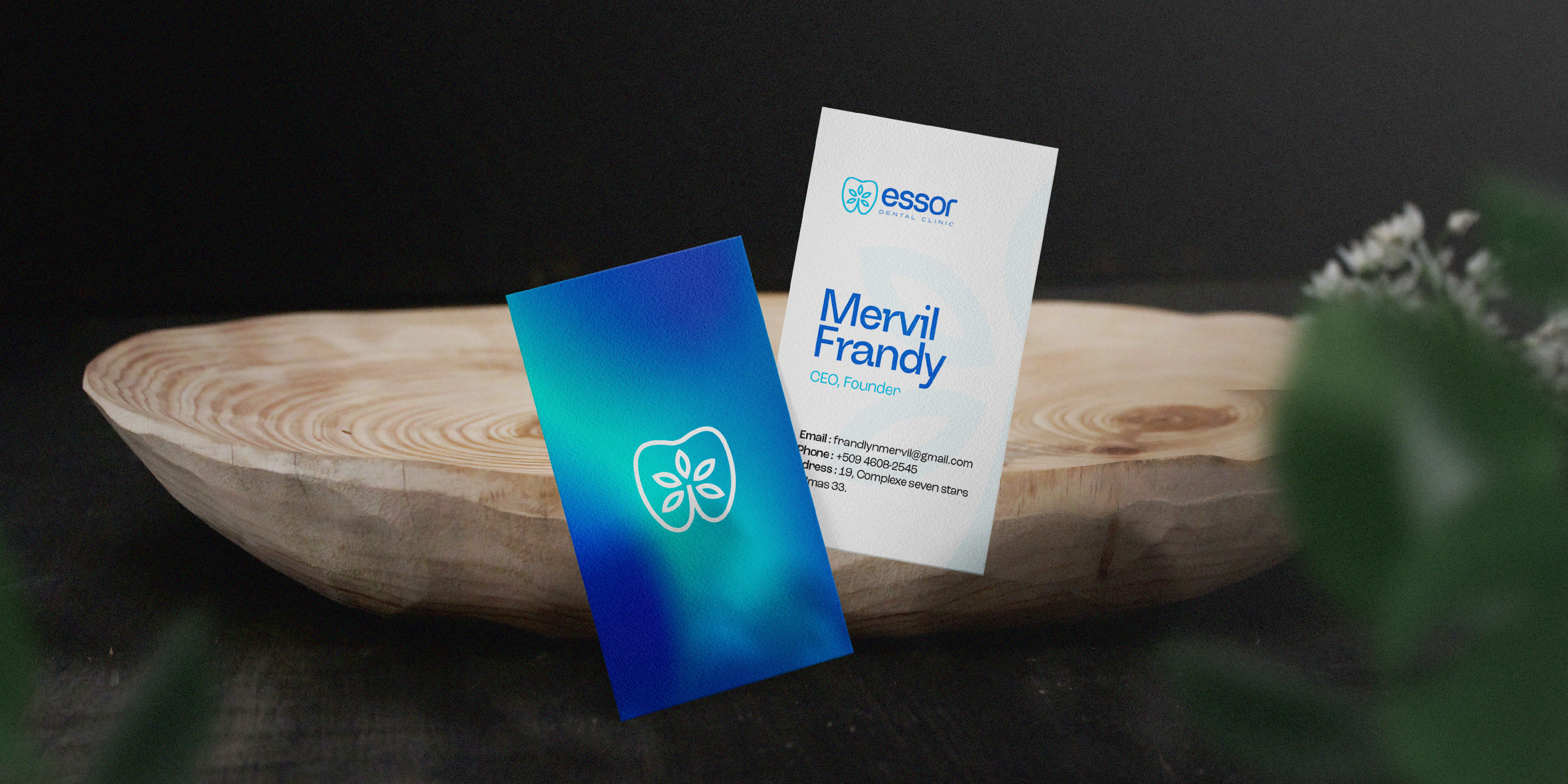
The identity is supported by a fresh palette of light blue, vibrant blue, and turquoise, expressing cleanliness, trust, calmness, and vitality. A clean, contemporary typographic system gives the brand a professional yet approachable character, while the flexible logo system allows ESSOR to remain recognizable across different applications, from clinical uniforms and stationery to digital platforms and social media. Overall, the brand positions ESSOR as a reliable, welcoming, and forward-thinking dental clinic where expertise and patient well-being come together.